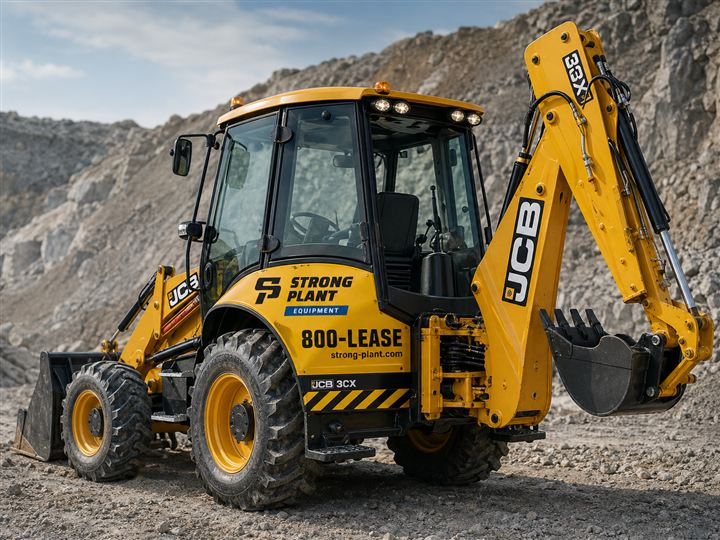
Most brand guidelines are written for screens and printed paper. This one also had to work at three metres wide on the side of a dump truck, under Gulf sun, on a surface that gets hit by rock. We built a complete branded-house system for a group operating in equipment rental, energy and trading — a 45-page guideline, one mark across three divisions, and 25 production-ready templates that reach from a business card to a container marking.
Strong Plant runs three businesses under one name — Energy, Equipment/Rental and Trading. Each had drifted into its own look. Quotes went out in three different formats. Machines carried whatever the last signwriter had done. A client who rented an excavator and then bought a generator had no way to know they were dealing with the same group.
The instinctive fix — give each division its own colour — is the wrong one for a company this size. Colour-coded divisions fragment a small group's recognition into three weak signals instead of one strong one, and they create an impossible problem on shared assets: which colour does a truck get when it carries generators to a rental site?
There was also a physical constraint that ordinary identity work never faces. The brand's highest-visibility surfaces are not screens. They are excavator booms, dump truck bodies, generator canopies and shipping containers — seen at distance, at speed, in glare, and applied by a vinyl shop rather than a designer.
We built a branded house: one master mark, one palette, and divisions differentiated only by a wordmark in a chip lockup — never by tinting. That single decision is the spine of the system. It means every asset the group owns reinforces the same recognition, and a shared truck is never a problem to be solved.
Three principles govern every decision in the guideline. Built to perform — compositions are structural, grids disciplined, no decoration without a job. Quiet confidence — authority is earned on site, not declared on screen; yellow is punctuation, not shouting. Engineered edges — italic cuts, skewed rules and hard corners carry the industrial heritage without tipping into pastiche.
The palette is deliberately narrow: Ironwork Navy carries about 70% of surfaces, Signal Yellow is reserved for accent and emphasis, with Anvil Black, Paper and Concrete filling the rest. The guideline states the ratio explicitly, because "use yellow sparingly" is advice and "navy carries 70% of surfaces, never let yellow dominate a full layout" is a rule a third-party supplier can actually follow.
Everything is enforced by a single token file. Colour, type scale, spacing
and radii live in one brand.css imported by every template. Change a value
once and business cards, invoices, decals and the deck all move together — the guideline
and the artefacts cannot drift apart, because they read from the same source.
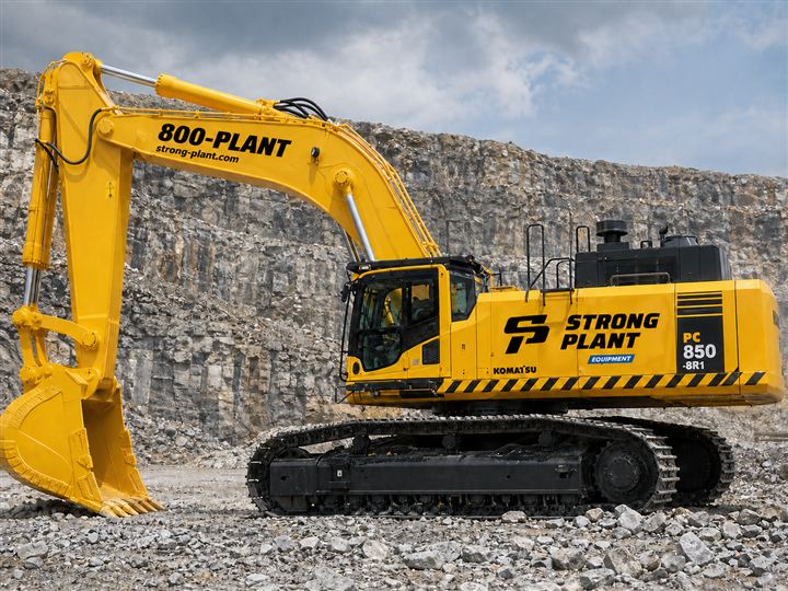
Strong Plant presents as one company across three businesses. The same mark that appears on a quotation appears on the machine that turns up on site, on the operator's badge, on the container it shipped in, and on the corporate website — because all of them are generated from the same token file.
The fleet livery does real commercial work. Every machine on a site is a billboard carrying
the mark, the division, and 800-PLANT / 800-LEASE at a size that
reads from the road — a rental fleet that advertises itself while it earns.
And because the system is documented rather than tribal, it survives suppliers. A new signwriter, printer or agency can produce correct work from the guideline without a briefing call — which is the only test of a brand system that actually matters.
| Category | Templates delivered |
|---|---|
| Stationery & documents | Business card · Letterhead · Envelope · Invoice · Quotation · Rental quote (screen + print) · Purchase order · Delivery note |
| Digital & presentation | Presentation deck · Email template · Email signature · Social templates |
| On-site & fleet | Equipment decals · Generator decals · Vehicle livery · Container markings · Site signage · Stencils · Asset plates |
| People & identification | ID badge · PPE & apparel |
| Governance | Brand architecture map · Sub-brand lockups (9 variants) · Brand misuse (12 don'ts) · Photography direction · Colour & finish specification |
A brand system is only real if a supplier
who never met you can execute it correctly.
Fragmented identity is a discount
you give away for free.