The wordmark, at twenty-six metres
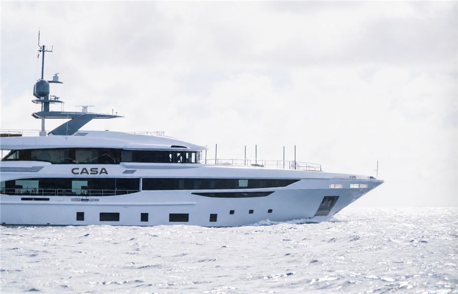
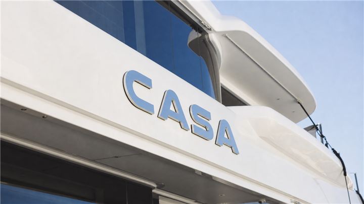
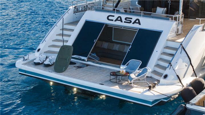
A mega yacht was being renamed. Everything the brand touched had to be redrawn with it — not just a logotype, but the wordmark at twenty-six metres on the superstructure, the six-colour palette taken from the vessel's own materials, and the entire onboard hospitality programme down to the fragrance in the bathrooms. We delivered it as CASA — Brand Identity, Volume I: a 55-section brand book of 132 plates, plus the production artwork behind every one of them.
Renaming a yacht is not a logo change. A charter vessel of this class is a hospitality business whose guests spend a week inside the brand — sleeping in it, eating in it, washing in it. Every surface a guest touches is a brand surface: the throw on the bed, the bottle in the shower, the napkin under the cocktail, the card left at turndown, the polo the crew wears.
The vessel already existed and already had a reputation under its previous name, with a charter brochure and a photographic library built around it. The rebrand had to be complete enough that nothing residual survived, and confident enough that the new name read as an upgrade rather than a disguise.
The other constraint is physical and unforgiving. The same mark had to work applied at twenty-six metres across a superstructure, seen from a helicopter and from a tender at waterline — and embossed at a few centimetres on a bath mat. Almost no identity is asked to span four orders of magnitude.
We started from a positioning line rather than a logo: Casa is a private home at sea. Not a hotel, not a superyacht in the ostentatious sense — a house. Four words govern every decision that follows: Sanctuary. Craft. Horizon. Hospitality.
The logotype is one drawing, one geometry — set in Nulshock Bold, a licensed typeface with the EULA held on file, so the client owns a defensible right to use it commercially. The mark is a measured letter in a quiet field, with generous clearspace specified as a property of the drawing rather than a suggestion.
The palette was found on the vessel, not chosen from a swatch book: Carbon and Ivory as the primary pair, then Hull, Mist, Brushed Steel and Aged Brass — the actual materials of the boat. Six colours, and the sea between them. Because the colours already exist physically on board, printed and embroidered applications sit correctly against the interior instead of fighting it.
The brand book itself is authored as a designed HTML document and rendered to print through a purpose-built pipeline: headless Chrome to an RGB PDF, then Ghostscript to DeviceCMYK with an ICC profile at 300 dpi, lossless. That choice matters — it means the book is a living source that regenerates to a press-ready file on demand, rather than a static artefact that decays the moment something changes.
text-rendering: geometricPrecision produces per-glyph bounding-box outlines
in Chrome-generated PDFs; text-shadow leaves matte artefacts when flattened;
and light-on-dark rgba() text picks up a translucency halo during CMYK
conversion. Each was fixed in a generated print variant, leaving the original document
untouched.
CASA has a complete, documented identity: logotype and stamp in vector masters, a licensed typeface, a six-colour system taken from the vessel itself, and a 132-plate brand book that specifies every application from the exterior livery to the smallest amenity.
The practical value is supplier independence. A linen mill, an embroiderer, a glassware supplier, a fragrance house and a signage fabricator can each produce correct work from the book without a briefing call — which is the only real test of a brand system, and the difference between an identity that holds and one that drifts within a season.
A separate charter collections document was produced alongside the brand book, and a holding page currently occupies the domain while the vessel's commercial programme is prepared.
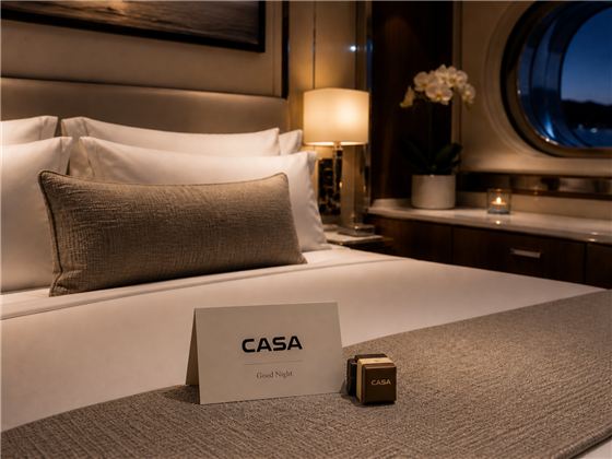
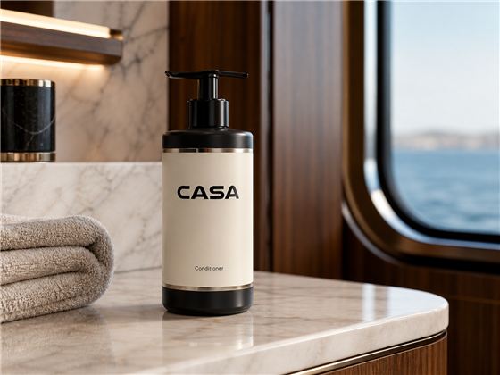
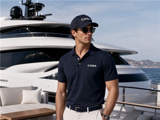
A guest spends a week inside this brand.
Every surface is a brand surface.
A logo is the easy part.
The system is what your suppliers execute.